PlanGo
PlanGo
PlanGo
A travel brand built around discovery, movement, and ease.
A travel brand built around discovery, movement, and ease.
A travel brand built around discovery, movement, and ease.

Year
2026
Client
PlanGo
Category
VisuaL Identity
PROJECT OVERVIEW
PROJECT OVERVIEW
PlanGo is a travel platform designed to make discovering and planning new experiences feel simple, flexible, and visually engaging.
The Concept
The Concept
The identity was built around the idea of “Go” turning movement and discovery into a recognizable part of the brand itself.

THE LOGO
THE LOGO
THE LOGO
The “Go” element became the distinctive part of the wordmark, giving the logo a sense of movement while keeping the overall form simple and recognizable.
The visual system starts with a strong and recognizable core identity, supported by carefully considered typography, color, and graphic elements.
The goal was to create a system that could remain consistent across different applications without feeling repetitive.

COLORS
COLORS
COLORS
A vibrant palette combines purple and teal with softer supporting tones, giving PlanGo a flexible visual system that can adapt across travel content and digital experiences.
The visual system starts with a strong and recognizable core identity, supported by carefully considered typography, color, and graphic elements.
The goal was to create a system that could remain consistent across different applications without feeling repetitive.

Typography
Typography
Typography
Parkinsans and IBM Plex Sans Arabic create a clear bilingual system, balancing a friendly contemporary tone with readability across Arabic and English communication.
The visual system starts with a strong and recognizable core identity, supported by carefully considered typography, color, and graphic elements.
The goal was to create a system that could remain consistent across different applications without feeling repetitive.


VISUAL LANGUAGE
VISUAL LANGUAGE
VISUAL LANGUAGE
A playful visual language was developed through travel-inspired icons, graphic elements, and repeating PlanGo patterns that give the system more flexibility beyond the logo itself.
The visual system starts with a strong and recognizable core identity, supported by carefully considered typography, color, and graphic elements.
The goal was to create a system that could remain consistent across different applications without feeling repetitive.


BRAND IN ACTION
BRAND IN ACTION
BRAND IN ACTION
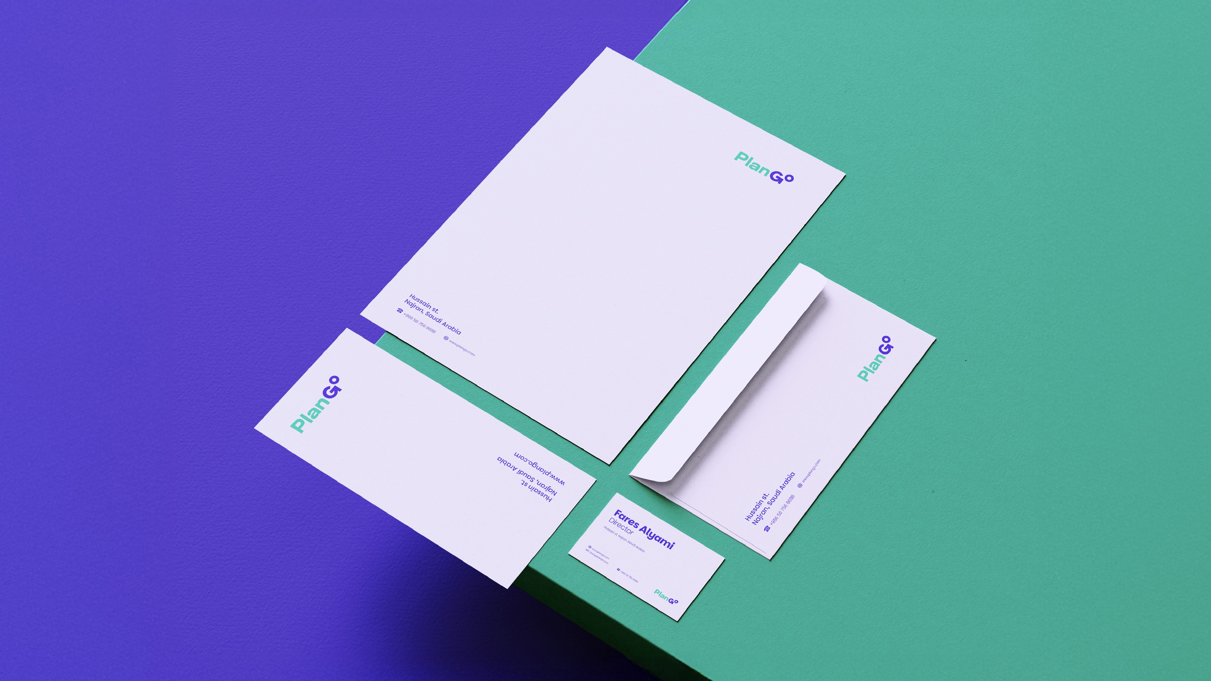
The identity was extended across digital and physical touchpoints, from social content and outdoor advertising to the website, app, and branded materials.
The visual system starts with a strong and recognizable core identity, supported by carefully considered typography, color, and graphic elements.
The goal was to create a system that could remain consistent across different applications without feeling repetitive.


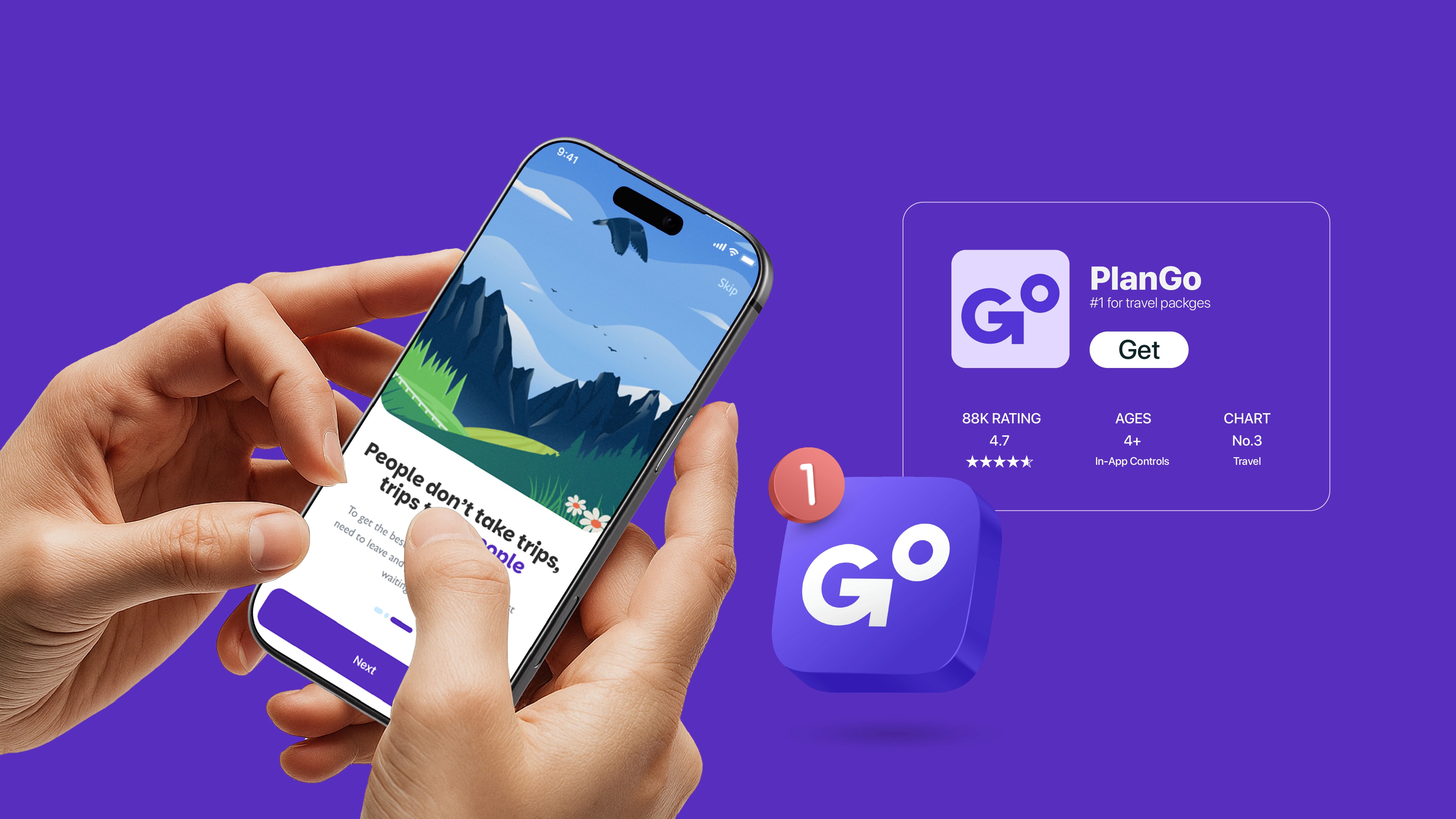
The PlanGo app icon keeps the brand simple, bold, and recognizable, with a friendly “Go” element that communicates travel and movement.
The PlanGo app icon keeps the brand simple, bold, and recognizable, with a friendly “Go” element that communicates travel and movement.
The PlanGo app icon keeps the brand simple, bold, and recognizable, with a friendly “Go” element that communicates travel and movement.
The icon can adapt to cultural moments, using subtle Sadu-inspired details for occasions like Saudi National Day while keeping the core identity intact.
The icon can adapt to cultural moments, using subtle Sadu-inspired details for occasions like Saudi National Day while keeping the core identity intact.
The icon can adapt to cultural moments, using subtle Sadu-inspired details for occasions like Saudi National Day while keeping the core identity intact.



More Works More Works


BASED IN Cairo,
Egypt

CREATIVE DESIGNER
BASED IN Cairo,
Egypt
CREATIVE DESIGNER
BASED IN Cairo,
Egypt
CREATIVE DESIGNER