Pro Lux

Pro Lux

Pro Lux

A premium automotive protection brand created for the Saudi market.

A premium automotive protection brand created for the Saudi market.

A premium automotive protection brand created for the Saudi market.

Year

2026

Client

Pro Lux

Category

VisuaL Identity
THE CHALLENGE
THE CHALLENGE

The Saudi automotive protection market is highly competitive, with brands competing across PPF, detailing, and vehicle care. The challenge was to create a visual identity that balanced durability with a premium feel for high-end vehicle owners.

The Solution
The Solution

The identity was built around a strong, technical visual language that balances durability with a refined premium feel. Geometric forms, sharp details, and a restrained aesthetic give PRO LUX a distinctive presence suited to high-end automotive care.

THE NAME

THE NAME

THE NAME

The name was developed to communicate the brand’s positioning from the start — combining “Professional” and “Luxury” into one concise name: PRO LUX. 

The visual system starts with a strong and recognizable core identity, supported by carefully considered typography, color, and graphic elements.

The goal was to create a system that could remain consistent across different applications without feeling repetitive.

THE IDENTITY

THE IDENTITY

THE IDENTITY

The identity was developed to balance technical protection with a refined automotive aesthetic, creating a visual presence that feels strong, premium, and precise.

The visual system starts with a strong and recognizable core identity, supported by carefully considered typography, color, and graphic elements.

The goal was to create a system that could remain consistent across different applications without feeling repetitive.

THE SHAPES

THE SHAPES

THE SHAPES

A set of geometric shapes was developed to explore the visual language and create a flexible graphic system for the brand.

The visual system starts with a strong and recognizable core identity, supported by carefully considered typography, color, and graphic elements.

The goal was to create a system that could remain consistent across different applications without feeling repetitive.

BRAND IN ACTION

BRAND IN ACTION

BRAND IN ACTION

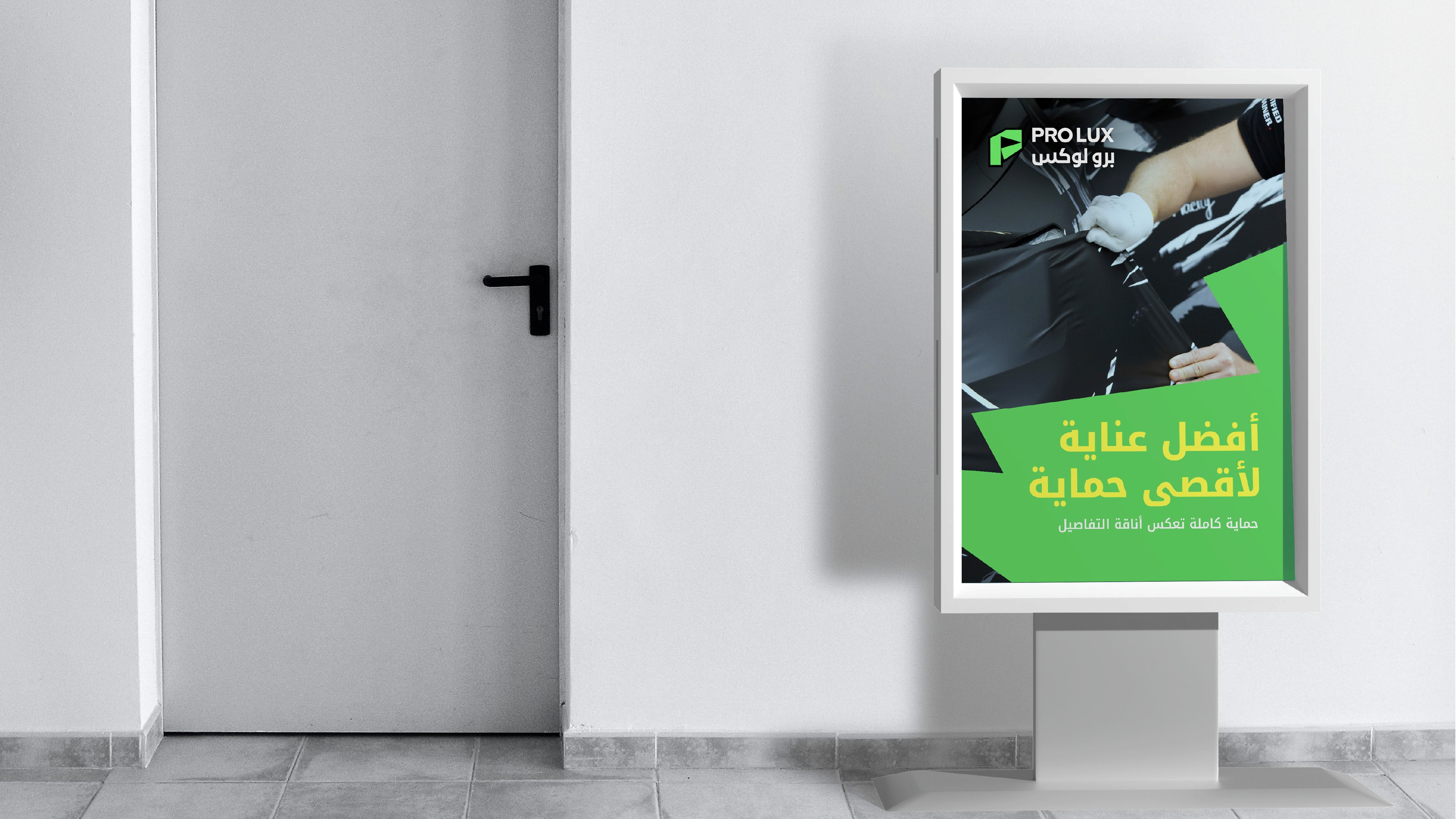
The identity was extended across the brand’s physical and digital touchpoints, keeping the same premium character across every application.

The visual system starts with a strong and recognizable core identity, supported by carefully considered typography, color, and graphic elements.

The goal was to create a system that could remain consistent across different applications without feeling repetitive.

Let'S WORK

TOGETHER

BASED IN Cairo,

Egypt

Man

CREATIVE DESIGNER

Let'S WORK

TOGETHER

BASED IN Cairo,

Egypt

Man

CREATIVE DESIGNER

Let'S WORK

TOGETHER

BASED IN Cairo,

Egypt

Man

CREATIVE DESIGNER

Let'S WORK

TOGETHER

Man